In our project about Narcolepsy I learned that sleeping symptoms are triggered by extreme emotions such as excitement, happiness, sadness, or fear. Having this disorder, it seems important to keep your emotions under control at all times.
Me and Amy decided on our disorder knowing that we wanted to make an entertaining video. Pearl and Nick seemed to agree with whatever we chose. As a group I really don't know how well we worked together, Amy and I made the video ourselves and Pearl talked about her mom during our presentation, so it worked out fine but we didn't do anything together as an actual group. Nick didn't help with the video and he didn't say anything during the presentation sooo....
On this project I feel like Amy and I came up with something creative and fun to show to the class, not just educational, it was different. I think we should get a 85-99.
Tuesday, April 19, 2011
Monday, April 11, 2011
Spring break
Top three wins over the break.
1) Me and Amy made a parady video of the whitest kids you know "sex robot"
- http://www.youtube.com/watch?v=tnyfPmx4-28
I consider this a win because even though most people would watch this and think "wtf" we still had alot of fun making it.
2) It was FINALLY warm enough to go to the creek and actually do things outside, summer is getting closerrrrrrrrr.
3) Realising that I have been going to school since kindergarten, and I only have roughly 50 more days!
Top three losses.
1) A few days before break actually started, a dog that I have had since I was in fourth grade had to be put to sleep, a disk in his back was messed up and he had got to where he couldn't walk on his own.
2) I got a letter a few days ago about a job in the summer that I was sure I would get, the letter told me that they were unable to provide a job for me this summer... Sooooo still unemployed...
3) Realising that I have been putting off sending my transcripts to the college I was accepted to, and now I only have a few more days to do that or I will have to wait a semester to start -thumbs up-?
Favorite Media
- Over the summer I found my DVD of the movie benchwarmers, it's not a new movie but I hadn't seen it in a couple years and when I watched it I remembered why I used to love it, it was my favorite movie that I watched over break. I don't think I saw any new ones.
Reading........
To be completely honest, I hate reading... I have NEVER voluntarily read a book, so nope, I didn't read anything over spring and the only reason I can think of is that i'm lazy. : D
Monday, March 7, 2011
Frankenstein Book Cover
This week our assignment was to pick a book and recreate the book cover, with new ideas, concepts, and images. I decided that since we had recently finished Mary Shelley's brook Frankenstein in English, I could recreate that cover, so I began research on previous book covers to get an idea of what I wanted to do.


This is what the book cover looked like of the one we just finished reading. To me it doesn't repersent what Frankenstein is all about. When Mary Shelley made this story she wanted it to be something scary, that would give people goose bumps, that kind of thing. I know that people say "Don't judge a book by it's cover" But you and I both know that everyone does that. If I had just picked this book up off the shelf I honestly probably wouldn't choose to read it, the cover is so boring, there's nothing scary about the cover, it doesn't represent very well what the story itself is about. This is a great book and if it hadn't been for my english class I probably would have never thought twice about it picking it up off the shelf.
While creating my cover I was keeping in mind everything I just mentioned, I knew I wanted to make a new cover, one that wasn't like the original at all, and one that would grab people's attention, not make them put the book back on the shelf. I took what I felt like were the most important symbols in the book and assembled them together in a creative way that I think is more interesting and connects to the book a lot more.
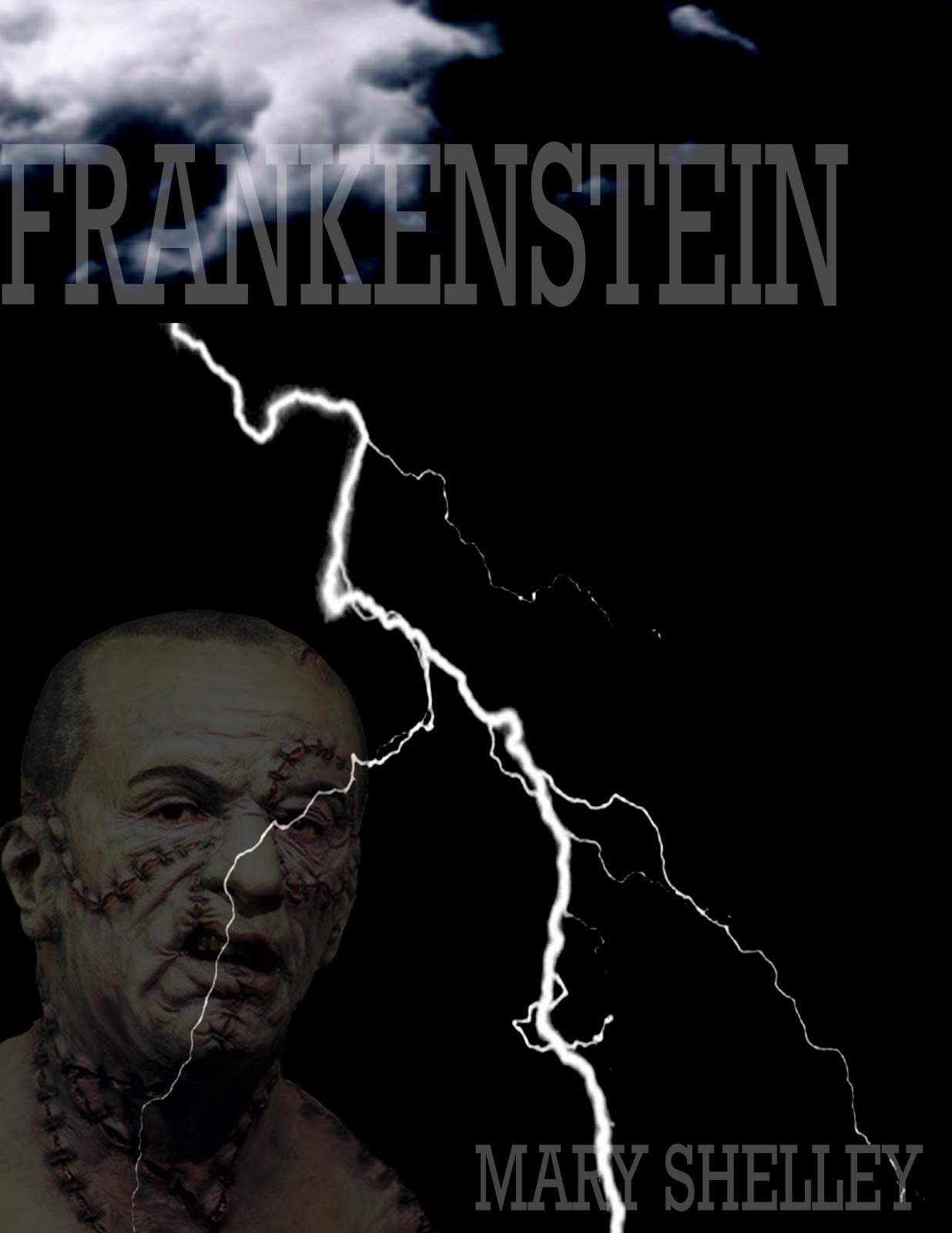
That's it. I like keeping things simple but I think I added elements that would be more likely to grab people's attention. Along with the the title and author, I chose the lightning because in the story, Victor Frankenstein discovers that with electricity, he can bring life into dead things, what better way to represent electricity than lightning. The other picture explains itself, I feel like if you're going to write a story about a creation, you should give the readers a visual of what he looks like, so that's my reason for putting that picture on there.
I didn't really have any trouble with this project, I enjoyed doing it, and got done fairly early. I also feel like with the cover I accomplished everything that I wanted to with it: Keeping it simple, Making it more interesting.
Tuesday, March 1, 2011
New Animals!
When I sat down to start thinking of ideas of how to mix animals to make a completely new one, I decided that 1) I wanted to be completely creative. 2) I wanted my new animals to be humorous.
 This was my first animal, I had the most fun making this one, I think it's a little humerous. All I did was take the wings of a bat and put them on the back of an elephant and colored in the wings to make it look like it was part of the elephant. The tail is a feather duster, Once i put it behind the elephant I thought it made for a good tail for this animal.
 This was animal #2... Yes that is a Giraffe's head, and yes that is a dauchsand's body. For my second animal I knew that I wanted to mix a larger animal with a smaller animal because I felt like the complete opposite porportions would be funny. The only problem I had with making this animal is that I couldn't figure out how to mix colors between then dog's body and the giraffe's head, I tried several things but everything looked crappy and done by a sixth grader, so at the end of the day i decided to leave the two seperate peices their own color.
I liked this project, it was probably one of my favorite from this class. It was frustrating when my first animal didn't save right but overall i'm happy with what i made.

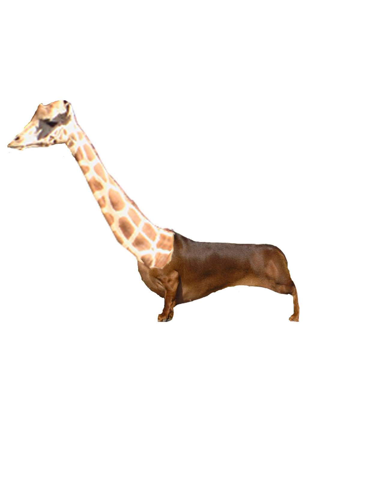
I liked this project, it was probably one of my favorite from this class. It was frustrating when my first animal didn't save right but overall i'm happy with what i made.
Monday, January 31, 2011
Slogans
1. A Bit Of Summer In the Winter Time.
2. Out-Smart Mother Nature.
3. It's Summer All Year Round.
4. Keeping Warm Since 1988.
2. Out-Smart Mother Nature.
3. It's Summer All Year Round.
4. Keeping Warm Since 1988.
Friday, January 28, 2011
New Logo

The next step of the project is to think of some new slogan for the company. I have some ideas based on the fact that Carhartt's main goal when they began was to keep people warm.
Thursday, January 13, 2011
Carhartt Inc.
I chose to do my computer apps project on the company Carhartt, it's winter so I thought what better company to chose than one that basis their clothing around keeping people warm. While doing this project I learned a whole lot about this company that most of the public probably wouldn't think twice about.
 As you can see, yes it may serve it's purpose but it's a little plain and boring. Forgettable even. My job in computer apps was to recreate this logo and give them a new slogan. I like the full moon resembling the "c", I think that's creative, in my design i definitely want to keep that. I don't have any ideas on the look itself other than i know i want to keep the moon looking thing and I want to change the colors from black and white, to make it more exciting and stand out more. My new logo will be completely unique and different.
Carhartt was founded in 1889, it is a family owned company that began in the United States but is now in parts of the world such as Canada, Europe, the Middle East, and Asia. The corperation began with railroad workers needing more sturdy clothes to keep them warm in the winter while doing work. But soon in the early 1900s the Carhartt jackets became popular within the drug dealing community because it was said that "they needed to keep warm and carry alot of things at the same time." Kids began seeing the jackets being warn on the street and this is how Carhartt fashion became popular in the Hip-Hop culture at first. Then it expanded all over the world not only making jackets but everyday clothes. More recently in 2007 Carhartt released a new clothing line called "Carhartt for women" it was to provide women with work clothes for the winter/fall/spring seasons. Now in 2011 Carhartt has not only expanded all over the world but also makes t shirts, long sleeves, hats, for men and women of all ages.
Carhartt's logo is hard to explain in words.. so i'll just put a picture:
As you can see, yes it may serve it's purpose but it's a little plain and boring. Forgettable even. My job in computer apps was to recreate this logo and give them a new slogan. I like the full moon resembling the "c", I think that's creative, in my design i definitely want to keep that. I don't have any ideas on the look itself other than i know i want to keep the moon looking thing and I want to change the colors from black and white, to make it more exciting and stand out more. My new logo will be completely unique and different.
Subscribe to:
Posts (Atom)